18 Card Challenge - Design Time
Share
Jason is at Spiel, but he would like me to remind you that my opinions are my own, and do not actually constitute Button Shy policies. Also he wanted me to tell you that I am very smart and handsome. His words, not mine.

Welcome back! This is the third article about the 18 Card Challenge. I've described our judging process, talked about pitch videos, and now it's time to dive into the actual game design bit. I'll be including advice from some of the other judges, answering some questions from Twitter and Discord, and hopefully helping you craft a better game.
The first thing we have to discuss is Brave Rats.
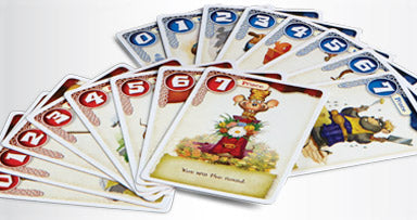 photo: Blue Orange product page
The Brave Rats Proposition
When we first started doing contests (back before it was the 18 Card Challenge), one of the most frequent types of submissions we'd see were two player simultaneous-reveal battle games. It got to the point that I offered the following advice for any aspiring Button Shy designer:
Step 1: Play Brave Rats
Step 2: Don't design Brave Rats
Don't get me wrong, I love Brave Rats. In fact, Jason was the person that told me to check it out, and I'd be willing to wager it was at least part of the inspiration for a line of 18 card games. There's not much I'd change about Brave Rats, and that's exactly the point. If you come to us with a simultaneous-reveal card game where you compare strengths and use some abilities, you'll have a tough time making an impression.
I want to be extremely clear right now and say that every game has a shot, because we respect the effort that you put into your submissions. However, you're stacking chips against you if you redesign Brave Rats.
 photo: @whatseplaying, from his great preview
Step 3: Play Sprawlopolis
Step 4: Don't re-make Sprawlopolis
The single worst thing about this game is that I had absolutely nothing to do with it, and I wish I did. Aramini, Devine and Kluka followed up their gem Circle the Wagons with what I consider to be the hallmark of the Button Shy collection. A staggering 5500 people backed it on Kickstarter, and it continues to be the top seller. 1200 more people added it to their Tussie Mussie pledge back in June. The identical card challenge seemed to lend itself to tile layers, but any such game would have to be incredibly special to join a lineup with such a heavyweight.
Many of the judges remarked that submissions were stripped down or re-themed versions of existing Button Shy games. Supertall designer Nat Levan (he's a normal height, he just designed a game about skyscrapers) pointed out that this is a great design exercise, but can't win a contest. Taking a game you like and retooling it to fit a certain format can help you to explore the design space, however you'll need something novel to submit.
Ben "the Mayor" Begeal pointed out that if you're going to offer us your take on a Button Shy game, it has to have a "but" or an "and." Maybe it's Turbo Drift but real time, or Herotec and sidekicks. Keep in mind that "but it fits this month's restriction" and "but it's a new theme" are not enough to earn you a spot in the finals.
I'll let Jason himself have the last word on this topic. "There’s a weird line that we’re walking. We're looking for the best game to declare winner of the contest, and not necessarily the best game to publish, but at the same time the best game can’t already exist in the market. If we’ve already published it, then it 100% exists in the market."
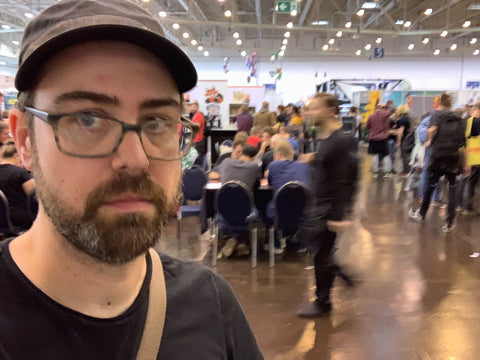 Jason is overwhelmed with the number of blurry people at Spiel
Theme a Little Theme
In our top 20 games for September, we have octopuses escaping fishing nets, canoes being paddled, mice collecting lint, coyotes howling, and whatever the heck a huffon is. It is undeniable that a novel theme will help your game get noticed in any contest you enter. Supertall Nat summed it up nicely: "Get noticed with a unique theme. I'd guess 50% of entries [that I saw] were generic fantasy fighting of some kind. That starts with an uphill battle to stand out and be remembered. A unique theme gives you a head start."
One question from Twitter was about any themes that Button Shy won't publish. My advice was to look at the publisher catalog of any company you are pitching to. If you pitch Murder House: the House of Murders to Button Shy, you've clearly not done any homework. Jason was quick to point out that no theme rules out a game, because he's willing to re-theme anything. This, of course, assumes that your game is re-theme-able. If the hook of the game is the fact that it's an 18 card Adults Only party game, better luck next contest.
Predicted response #1: "My theme was super unique, and I didn't make the finals!"
A great theme will only help you get noticed, not guarantee your success. This same idea applies to the pitch video discussion from last time. As the Mayor put it, "A pretty video doesn’t excuse a weak game. A good game can shine through a mediocre video. It’s all about the game." Whether it's an amazing theme, flashy video, or even great art, we're pretty good at looking at the game itself.
Predicted response #2: "I knew it, my game is great, but they didn't like my theme so I got overlooked." Space Scuffle is a space battle game, and Interceptor is CIA vs KGB, both of which have been done once or twice before. PIKE is an abstract, and Alphacross is a word game. If this were a theme-only contest, our top 20 would be different.
 Oh! That's a huffon!
No Can Art
When I saw those adorable creatures wrestling, "I want to try that game!" was a fairly knee-jerk response. I won't belabor the point from above; art helps you get noticed, but it is not required. In a contest, you want every advantage though, right? So how do you try to stand out if you don't have an art budget?
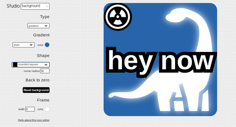
My first recommendation every time is Game-icons.net, which is currently up to 3701 free icons. Need to make a glowing, radioactive diplodocus, on a blue background, that says "hey now," for some reason? They've got you covered.
Another direction you can go is to hit up the googles and look for public domain art. Be very careful when you take anything from the internet for anything outside of your personal use. Even though your publisher will likely commission original art for your game if it's signed, you can come off as amateurish if you're pasting Magic the Gathering illustrations on your cards. Find something really unique on a site like Rawpixel, and be sure to note in your rules doc where you found the images, and the license.
Finally, if you feel compelled to commission some art (don't), and I mean really feel the need (but really, don't), I'd recommend Fiverr. There are a lot of artists there capable of amazing work that are looking for small projects to make a few bucks. Again, if I wasn't explicitly clear: I'M NOT SAYING YOU SHOULD COMMISSION ART FOR THIS OR ANY CONTEST, but when you're ready to take a prototype to the next level, it's there.
The white space enigma
(Ok, maybe "enigma" is overselling it, but a non-zero number of people were looking forward to this part. Hi kevnburg!)
The basis of this duplicitous position on the value of white space comes from cutting out cards to test games. It is here that I offer you a humble request: please do not put any space between the cards on your PnP files. The math is really, really simple. If a 3x3 sheet of cards is printed with all of the card edges touching, I only have to make 8 cuts to trim the margins and separate all the cards. If the cards are spaced, that number jumps to 12. It may seem minor, but when you've got a stack of PnP's to cut, it adds up.
While we're talking about PnP's, it's wonderful to offer a low-ink version if that's something you know how to do, and include assembly instructions, especially if there are variable card fronts and backs. Additionally, I think it's good practice to number your cards, both for assembly purposes, and for your playtesting notes (Place all of the same numbered cards back-to back... Card 3 might need +1 cost...).
So, when is white space good? I think that Jay "Cunning Folk" Treat summed it up perfectly: "You can only put so much on a card or in a rulebook. Hide the bulk of the game in the players."
I'd put that on a t-shirt if not for the possible literal misinterpretation. What Jay is trying to say is that oftentimes you have a vision for your game, or more specifically for how you envision the game being played. You add rules, conditions, and reminders to ensure that players are playing your game. But... are they? Are they playing your game, or acting in the play you wrote? Build a framework for them to operate, and let them show you what the game can do. One of the most lethal phrases a judge can utter about your game is that it "had very few decisions." Jason's aim is to create big experiences in a small package, and to do that, the players need to take center stage.
Where can you insert "white space" in your games? The first thing you can do is resist the urge to cram everything onto a card. Here's an example from Wonder Tales:
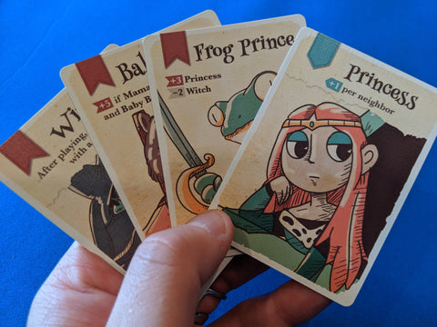
Scoring in Wonder Tales is based on placement and adjacency, and it would be easy to have lots of funky cards. Baby Bear's scoring is conditional, and the Frog Prince has +/- conditions. Then, there's the Princess. Put her in the middle. That's it. Is that uninteresting? Sure. It's hard to argue that she's as interesting as other cards, but your brain likes to have a Princess mixed in.
For one thing, if every card is weird, no card is weird. You need white paper for a yellow highlighter to work. Your brain also likes to rest from time to time. Whether it's a card with no abilities that just scores points, or a turn in a game where you perform some perfunctory tasks to build towards your fun combo, sometimes it feels good to just know what you need to do.
The final point I'll make about white space is that some of you need to literally put some empty space on your cards. By "empty" I mean that it contains no information pertinent to the game; it could be background graphics, art, or just open. The ICG contest was particularly taxing because many of you felt compelled to try to get a *lot* of stuff onto one card, but this axiom applies to any card game. Distilling a big box experience to a card game is a great approach to designing, but "distilling" is far different from "cramming".
Loopholes, then stick the landing
If I started punching you in the arm, you'd likely ask me to stop. I'd then promise not to do it again. When I subsequently punched you in the arm again, you'd be rightfully indignant, until I cleverly pointed out that I punched your shirt, not your arm!
What's the point of this verbose retelling of how I'd annoy my kid sister? Nobody wants their requests fulfilled with technicalities and loopholes. The September challenge was to design a game with identical cards, and quite a few of you addressed this by putting 4 different cards onto one card. These cards become a tracker, these only use the arrows on the left, this card is a divider between players, etc. While this might fit on a single card, it would clearly be better as multiple different cards, right?
The moment Jason posted the "surface-less" requirement for October, the loopholes here being discussed. What about a lap? What about the wallet? What about the ground? These are all punching someone in the shirt. An unwritten rule is that a game that adheres to the spirit of the contest will perform better than a game that doesn't. (Again, unwritten because there are exceptions. Looking at you Drive Like Hell).
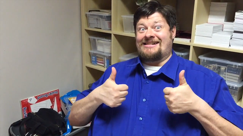 The Mayor believes in you!
Thank you for sticking it out with me until the end of this trilogy of articles. I hope there are some things in here that you can use to improve your designs and pitches. It's important to remember that these are all just tips, and if you have a vision, you should see it through. Get it onto some cards, play it until it's not broken, and show it to someone. The worst case scenario is that a new game exists in the world thanks to you.
